
multi-sensor cloud platform for storage, visualisation & analytics across Earth Observation, IoT, wearables & smart cities
Client: llcloud.eu, Sofia, Bulgaria
Project Type: End-to-end Platform UX | UI + Visual Identity
Role: Lead UX | UI Designer + Brand Designer + Motion Effects + SEO Strategy + Ongoing Platform Optimisation
Industry: Satellite Technology, Earth Observation, IoT, SaaS
Tools: Wix Studio, Figma, After Effects, JS (Velo), Google Analytics
Duration: 2024 | 25
LLcloud’s aims to empower developers by simplifying the integration of multi-sensor data into a unified platform.
LLcloud provides an easy way to collect, analyse, and visualise data from diverse sources, including satellite, IoT, and wearable sensors, enabling better decision-making.
By offering a seamless cloud solution for data fusion and analytics, LLcloud helps users leverage comprehensive insights from various data streams to drive smarter decisions.
CLIENTS
The platform is built for developers, SaaS companies, startups, and digital businesses looking for scalable cloud infrastructure.
LLcloud is targeted towards clients who need high performance, straightforward management and data analytics tools, and infrastructure that can grow and be customised with their products.
Our Partners


VISUAL IDENTITY
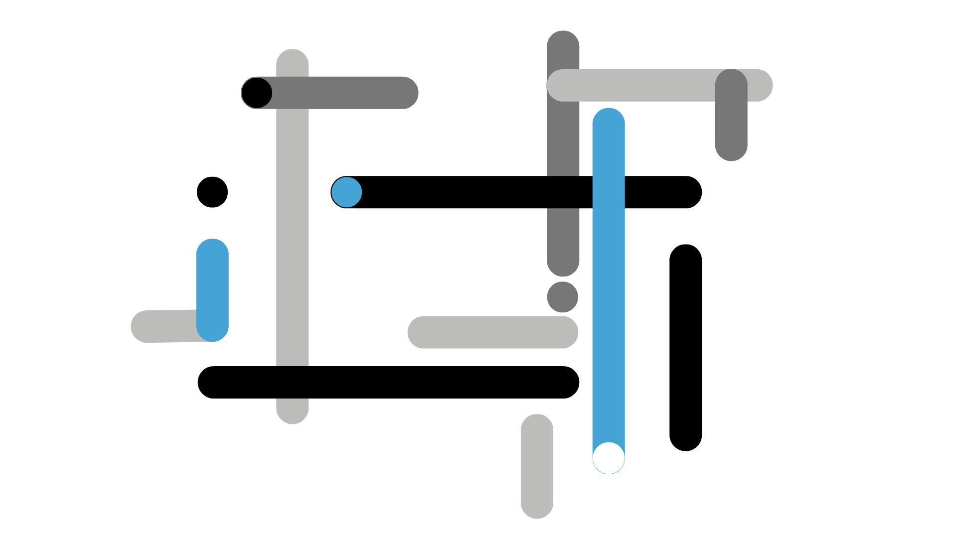
LLcloud’s visual identity was inspired by Piet Mondrian’s geometric abstraction and Powers of Ten by Charles and Ray Eames, translating the complexity of multi-sensor data into a structured, visually balanced system.
By drawing on Mondrian’s grid-based art and the Eames’ exploration of scale, the brand expresses the fusion of complex satellite, IoT, and wearable data as something precise, dynamic, and interconnected.

LOGO DESIGN
#45A4D4
#171718
#777778
#BCBCBB
MOTION EFFECTS
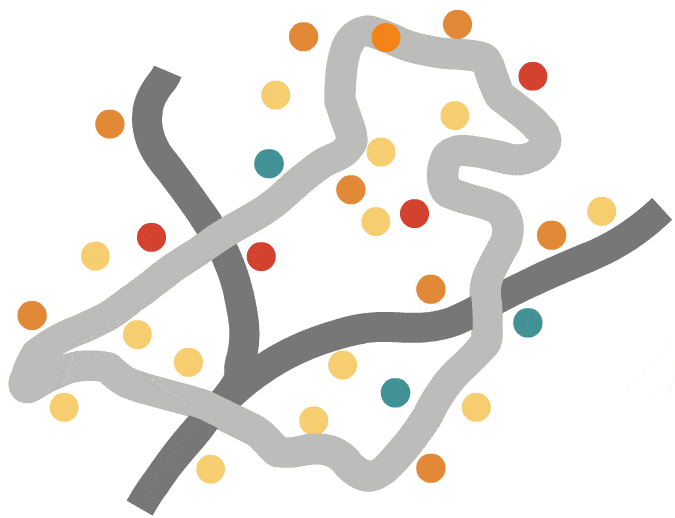
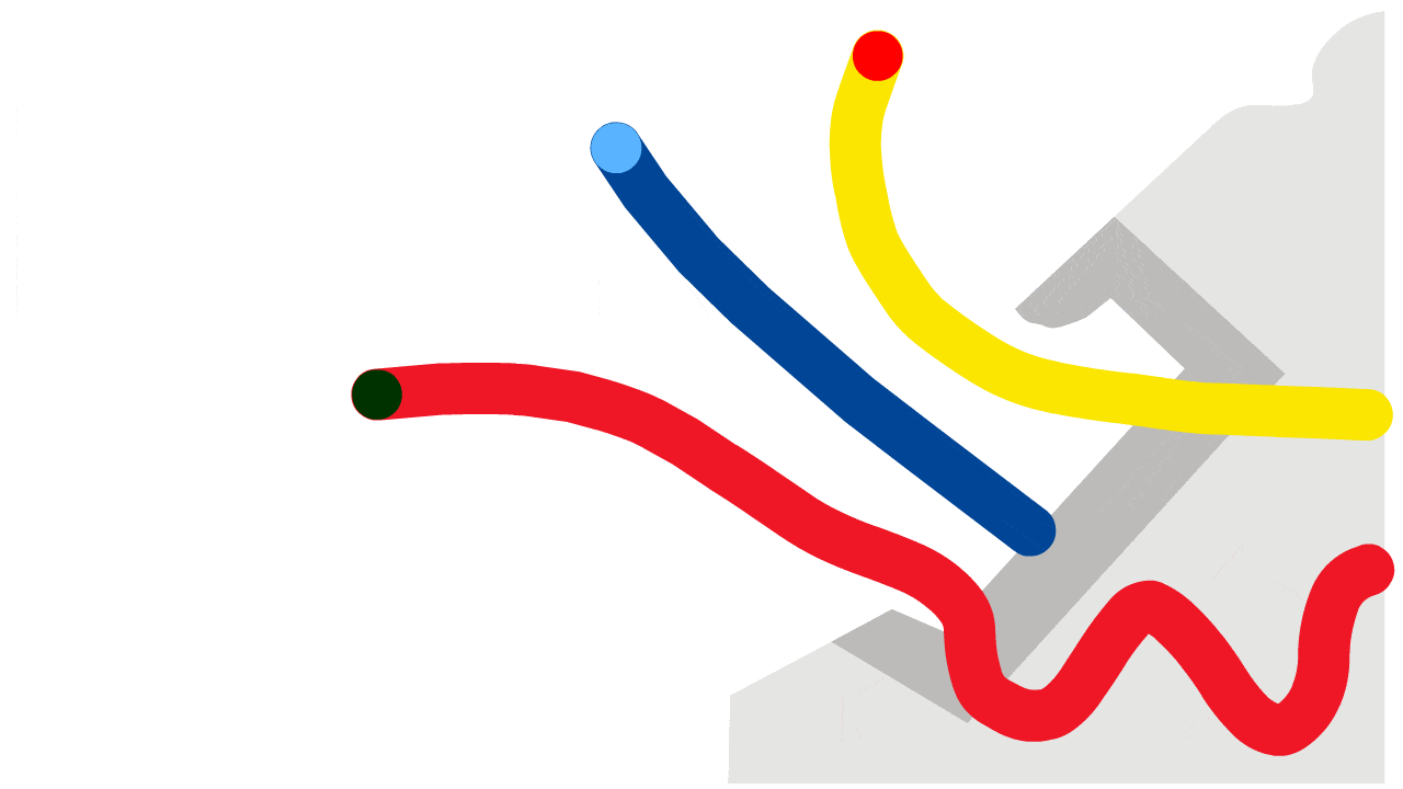
I developed a custom motion library to visually abstract the fusion of multi-sensor data across the platform’s services. In each animation, moving dots represent data sources, while connecting lines illustrate the pathways through which information flows.


IoT: Cyclist Air Pollution Tracking
Wearables: GPS Zoning & Fencing
Port Analytics: Cargo Flow & Distribution
SITEMAP
The client asked for a sitemap that emphasised the four primary application areas of the platform: wearables, IoT, Earth Observation (EO), and other digital technologies. We structured the site architecture around these verticals to help users quickly navigate to relevant use cases.
A dedicated Solutions section was also included to showcase practical applications of the platform in field research and industrial environments. The pricing structure was also redesigned to make feature differences, especially for EO workflows, more targeted.


UX & UI
-
Responsive mobile layout
-
Vertical content structure
-
Hamburger navigation menu
-
Stacked pricing cards
-
Desktop centralised homepage hub
-
Highlighted application sectors (EO, IoT, Wearables, Technologies)
-
Animated data-flow visualisations
-
Quick access: Get Started / Sign In

RESULTS & PERFORMANCE
45% increase in search visibility
5 min average site session
3000+ active page visits
75%+ traffic
direct returns
What we achieved in 2025 following the launch of the redesigned LLcloud platform in January:
6 new international data partners added (Swiss, Bulgarian, German)
Slush 2025 wearable product demo invitation
Cassini Hackathon 2026 Bulgaria organisers
EU Space Days invited platform demo
Team expansion across software and advisory roles


